Action Cards
This is where you’ll create and manage all of the Action Cards your users will see on their Home Screen in the Reach User app.
Managing your Action Cards
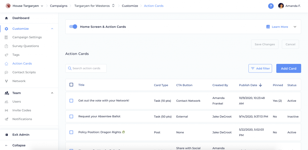
In the Action Cards Admin screen, you can see all of the basic details of your existing Action Cards, including the Title, Card Type, CTA Button, Created By, Publish Date, whether it’s Pinned, and the Status in the app (whether it’s Active or Inactive). You can search for a specific action card at the top, or add a filter to view only certain Action Cards. You can filter by Status, Card Type, whether it’s Pinned, CTA Button type, Created By, Published Before, or Published After.
Home Screen Setup
You can turn on your Home Screen for your campaign using the toggle at the top of the admin screen, or in the Campaign Settings screen in your Admin Dashboard. Additionally, you can customize the header text for your home screen here. You can even use templating like {{user.first_name}} and {{user.last_name}} to personalize your message.
Tip: Add your logo!
If you’re on Reach Complete or Reach Movement, your logo will display at the top of your Home Screen, as well as your Search screen. If you haven’t loaded a logo for your campaign yet, any Campaign Owner can do this on the Organization Details screen.
Creating an Action Card
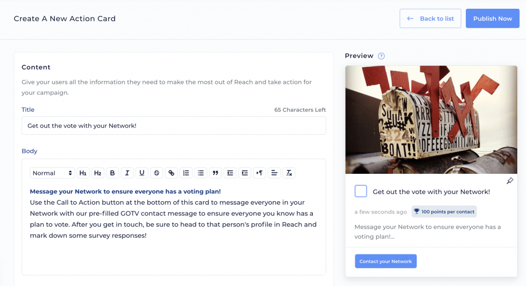
To create a new Action Card, you can click the “Add Card” button at the top right corner of your screen. As you edit, you’ll see a preview of your Action Card on the right side of the screen. The width of your card and banner image will vary based on the user’s device. You can customize the following fields in your Action Card:
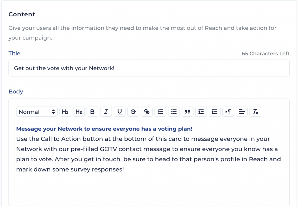
Content
- Title: Put your main ask here, like “Sign up to phone bank for Dany!” or “Digital door knock five new voters!”.
- Body: This is where you’ll want to put the details of your ask. If it’s too long to fit on a mobile screen, don’t worry – your users can tap the card to view a full-screen Action Card and scroll through all of your content. This content supports extensive rich-text formatting options so you can make these cards shine.
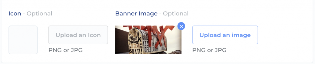
- Icon: This will display on the left hand side of an Action Card. Icons are not shown on “Task” type cards.
- Banner Image: You can add a banner image that will display across the top of an Action Card – pick any picture you’d like! The way this image is displayed to your users varies based on their device’s screen width. If you want to get specific, we recommend 556×230 px images (or any image with a ~2.4 aspect ratio – we’ll scale it for you and optimize it).
Type
Action Cards can be “Posts” or “Tasks”.
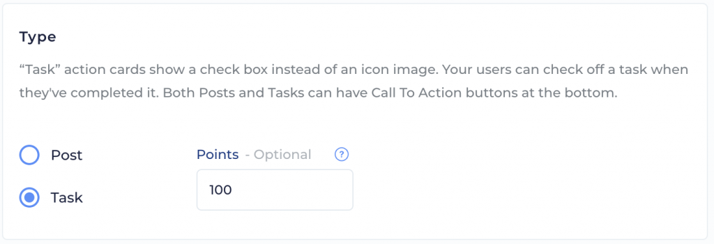
- Post: These always remain in the users’ feed and cannot be interacted with or completed. Use this type for more informational cards that are not specific one-time asks.
- Task: These replace the icon image on the card with an interactive check box. User can check the box to mark the actions as “complete”. Use this type for one-time actions you’d like a user to do.
- Points (Optional): “Task” Action Cards can have points assigned to them your users can earn by completing the task. Earned points can be seen on the “Action Points” leaderboard on the Rankings screen. Use whatever values you want up to four digits. Different types of action cards have different mechanisms by which you actually earn the points. Whenever possible, we try to have point-earning be based on actually doing the actions required. On Network Contact, File Upload , Content Upload, Content Share, and User Survey Action Cards, you get the points by actually taking the action the card asks you to take. You can also earn multiple points for completing the action more than one (sharing to multiple platforms, messaging multiple Network contacts, etc). For No CTA, Internal Link and External Link action cards, you get the points just for marking the card complete since there is really no action you’re expected to take in Reach, per se.
Visibility
All Active cards are visible to users with the newest ones at the top.
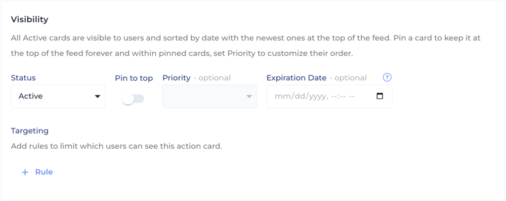
- Status: Set whether you’d like the Action Card to be Active in the app when you publish it, or Inactive (you can always set it to Active later).
- Pin and Priority (Optional): You can pin a message to the top of the screen so it’s always the first Action Card your users see. If you want to pin multiple cards to the top, you can use the Priority option to put your Action Cards in a specific order. For any pinned cards, your users will see a little “Pinned” icon on the action card in the app. Pin and Priority are both optional, so if you leave things as is, then your Action Cards will be ordered based on when they were created, with the newest at the top.
- Expiration Date (Optional): If your Action Card is for something at a specific date or time, like an upcoming event, you can set an expiration date and time for your Action Card to automatically remove it from the Home Screen once it expires. You’ll still be able to see expired cards in your Admin screen.
- Targeting (Optional): You can add targeting rules to limit which users can see the Action Card. Action Cards can be targeted by User Role, User Group, or even individual Users. They can also be targeted based on nested rules, various operators, boolean logic, and many more fields that describe which users should see the Action Card. Fields include State, Zip Code, First Seen On, Role, Source User, Source Campaign Key, User Groups, Email is Verified, and Has MyC VANID. This is helpful to delegate specific tasks to specific users without creating confusion.
Call to Action Button
You can choose to link an Action Card to somewhere internal in Reach, or any external web link, or not link it at all if you prefer:
Content Share
Share images, videos, and links to other platforms using other apps on your phone! If you select this option, you’ll use the Assets screen to make Link, Image, or Video assets, then use the Action Cards screen to make a Content Sharing Action Card which uses the asset.
Internal
Link to another screen within Reach. If you select this option, you’ll pick which screen to link to, and can customize the text in your Button Label.
External
Link to any other website or URL. Links will open in a new tab on web and an in-app browser in the app. If you select this option, you’ll enter a URL to link to, and can customize the text in your Button Label.
File Upload
When a user taps this button, they will get a way to upload a file or image, or take an image with their phone camera. They will also get a way to include a comment/note with the file upload. Images are required with this type of submission.
Content Upload
This action card will ask your users to provide content assets to the campaign for review. It will work very similarly to the Content Upload Flow from the My Uploads screen in the Library (more on that here) but you will be able to specify if you want to be requesting images, videos, or both. You can also choose whether to force a square crop on images and whether to have certain labels pre-assigned to any assets uploaded via the card. If you pre-assign labels, users will not be able to change them.
Once a user uploads content using a Content Upload Action Card, you can see it and review it like all other user-provided assets on the User Assets admin screen.
User Survey
Reach is great at helping your users canvass the people they meet by saving survey responses. But what about when you want to collect survey response data from those users themselves? User Survey Action Cards allow you to do just that! You can choose from any Question Set you’ve made and ask the users those questions. This may or may not be an active question set which the users are also asking voters.
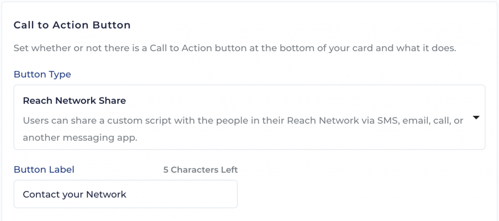
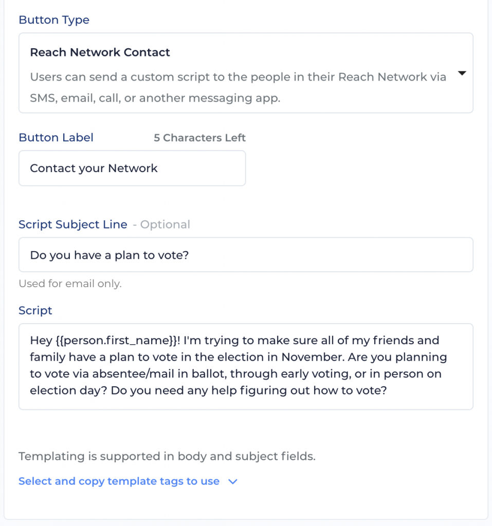
Reach Network Contact
Users can share a custom script in their Reach Network via SMS, email, call, or another messaging app. If you select this option, you can customize the text in your Button Label, and add a Script Subject Line (optional) and Script text to the Action Card.
Automatic Push Notifications
Every time you publish an Action Card, you get to decide if you want Reach to automatically send a push notification about that action card to your users. When users tap the notification, Reach will open directly to the action card. You can control the “Auto-Push” setting in the Visibility section of the Action Card creation form.

Then, when you click “Publish Now”, you’ll get another reminder just to make super duper sure you want to send the notification and give you a chance to change your mind:

If you proceed to publish with the Push Notification switch turned on, Reach will make, and immediately send, a notification targeted to all the same users who the action card is targeted to. If you have not specified targeting on the action card, the notification will go to all users who can receive push notifications on their devices. After the notification is sent, you can see it in the “Sent” table of the Notifications admin screen.
If you want to create an Action Card before it should be visible to your users, you should make sure to set its status to “Inactive” when you publish it and you must turn off the Push Notifications switch. There is no way to automatically send a push notification about an action card at any time other than the moment you first publish it.
Editing an Existing Action Card
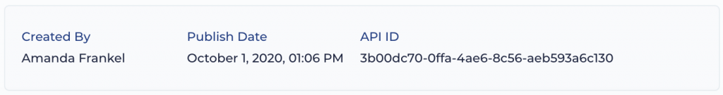
To edit or view details for an existing Action Card, you can click on it in your list on the Admin screen. There, you can view or edit Action Card details, including who created it, when it was published, and see its API ID.
Interactions and Responses Tabs
Click on any existing Action Card and in addition to the normal editing form, you’ll see an “Interactions” tab. This tab will give you a full view of all interaction history for this card. You will be able to see exactly which users viewed the card, tapped the CTA button, took action on it, and earned points. If you’re looking at a User Survey Action Card, you will see yet another new tab for Responses where you can see right there how users have been responding to the survey questions on the card. On both of these tabs, you can sort and filter the data, and you can even tap a new “Export” button to export the data from this table and download it is a CSV file.


